Reading Time: 2 minutes
PureNet Lead Designer – I’m immersed in the ecommerce website design industry and therefore always keep up to date with the latest trends. Working so closely with clients enables me to advise on what customers are expecting to see, what has longevity and how to best utilise their ecommerce space to achieve the largest conversions. I often get asked what the next biggest trends will be, so here’s a little insight into what you can expect to see in 2015.
1. Flat Design
Flat design isn’t a brand new concept, but since it exploded onto the ecommerce website design scene a few years ago backed heavily by the likes of Apple and Microsoft UI design 180, the methods with which it is used and its impact on conversions has been tracked and refined. The style is simply easier on eye and therefore encourages users to spend more time enjoying the experience of using your site, thus increasing conversions. Don’t however, discount subtle shadows and gradients, both of which were overused in the heady skeuomorphic style (realistic 3D design style) of days gone by. It’s ok to drop in a soft gradient here, or a delicate drop shadow there to highlight key actions on a page, my advice is to just be careful you don’t get carried away!
2. UI Transitions
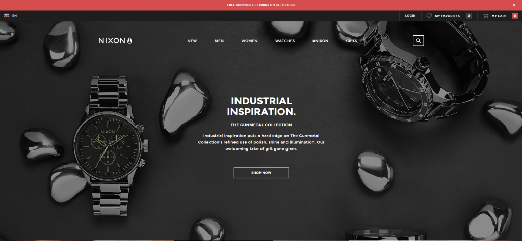
Another feature becoming far more accessible in everyday ecommerce website design is understated UI transitions and animations. Attention to detail in that final stage of an ecommerce solution build can make all the difference. Put simply the longer a potential customer spends on your page, the more likely they are to make you money and the more engaged they are with your brand. Putting a smile on their face does nothing but add to those chances. Hover animations such as button spins, icon rotates, and menu slide transitions used in the right place and the right time give customers that warm fuzzy feeling and make them feel like you care about their experience. Looking for some inspiration? The Nixon site looks beautiful and has lots of lovely little animated features that really wow you through the shopping experience.
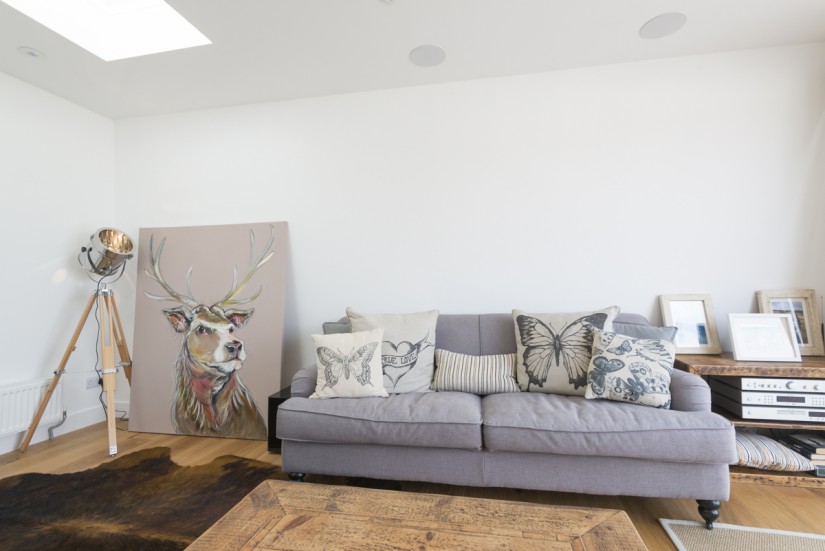
3. Immersive Product Imagery
A great tip for customer product-focused sites is to immerse the customer in your product so they feel like they own it before they’ve even hit the buy button. Investing in high resolution beautifully shot imagery is paying off for companies who have the foresight and resources to do so. A great tip for clinching the deal is having lifestyle shots that include your goods as a chaser to your main product images. I’m guilty of it too…sat on the fence not sure of whether to purchase. I’m often nudged into the basket process after seeing a product sat in a home, or worn by a sportsman in action. Immersive product imagery is extremely powerful and divinely worth investing in. Made.com do this very well, they even go one step further by allowing customers to post their photos of Made items place in their homes. These are featured on the Product Pages. Nice job Made!